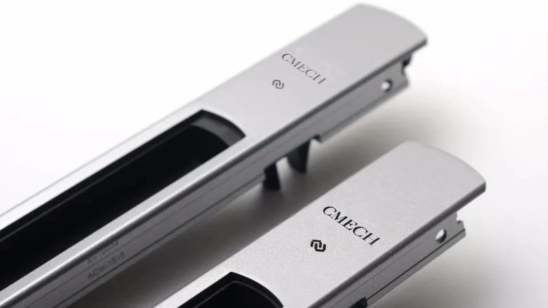
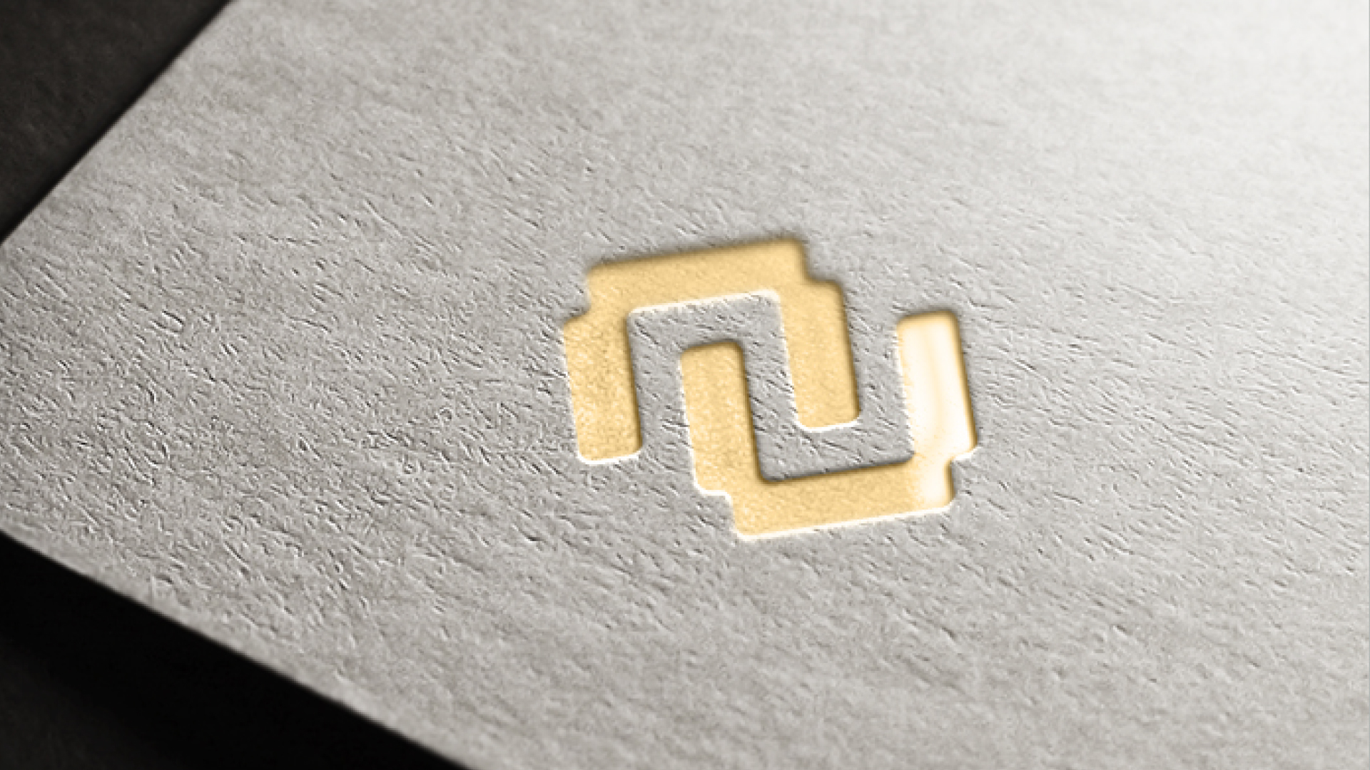
CMECH, a local hardware brand, is willing to embrace younger looks by doing something extravagant to challenge pre-existing standards in its industry. Meanwhile, by establishing its new brand image, it can achieve its goal of securing its market status as the one and only designer hardware brand out there. Therefore, the brand will attract more customers, increase its market shares, and eventually surpass all the competitors to be the most dominant one. In the design process, to make the brand and its graphics a whole, we applied a very consistent look and concept to it, making it look more up-to-date, sharp, and elegant. For its type-treatment, we designed a new san serif font dedicated to the brand, by adding a geometric and edgy feature to it. For its monogram, according to the client's request, we created a double C layout by composing two Cs facing each other to resemble the structure of two pieces of steel placed together.