After analyzing the construction industry's features, the logo's design was directly inspired by the influence of Brutalism in architecture.
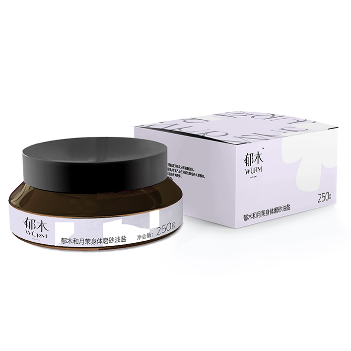
WÜRM targets a young audience keen on discovering and trying new things. At the same time, the brand strives to communicate ideas of self-awareness and rawness to its customers who embrace a minimalist lifestyle.
British International Course Centre is a private school that offers its students personalized, one-on-one study sessions.
A typeface has been crafted to embody the company's core values, illustrating that design should not only make an impact in one universe but across multiple domains, including branding, advertising, video making, and 3D modeling.
This is the continuation of my old project, a title-treatment I had done for a science magazine. Typographically produced in C4D, I articulated the conceptual meaning of the typeface by adding anther aesthetic dimension.
ZWCAD PackageTo help the company renew its brand image, we came up with two concepts.
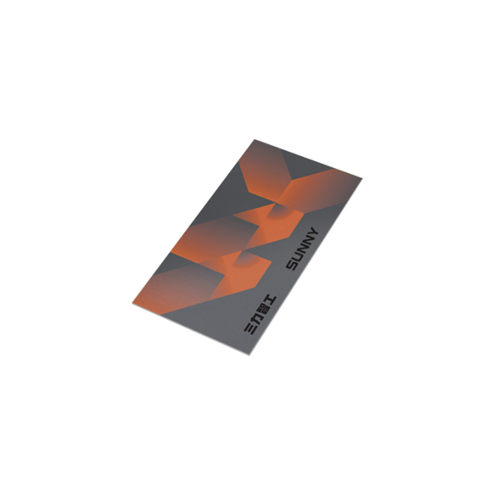
CMECH, a local hardware brand, is willing to embrace embrace younger looks by doing something extravagant to challenge pre-existing standards in its industry.